Forbes recently named Austin – my adopted hometown – the fastest growing large city in the U.S. I thought this would be a great opportunity to explore the phenomenon of trend analysis and how predicting the future is a huge part of our society, whether you realize it or not. Before I answer your burning question of how Austin could ever possibly surpass New York in population, let’s talk about trend analysis for a minute.
What is trend analysis?
Trend analysis is the practice of gathering data and analyzing it to identify patterns, or trends, in the data. Trend analysis is most commonly used as a method to predict future events.
The business of predicting the future
The folks that are paid to predict the future are called futurists. They used to be just called “fortune tellers” but I guess that sounded too magical and not professional enough. Just kidding…fortune tellers still exist and they still are “magical” and not professional. That’s because they predict the future for an individual…whereas, futurists look at society at large and make predictions about broad trends that will impact countries and industries. It’s actually a growing profession. They even have a professional membership organization The Association of Professional Futurists.
Another key distinction between futurists and fortune tellers is that futurists perform their work as social scientists, coming to their conclusions through extensive analysis of historical trends and the factors that shaped them. Fortune tellers, on the other hand, come to their conclusions by way of crystal balls, “magic” potions, and who knows what else. Of course, now matter how one goes about predicting the future, it is still risky business. As Yogi Berra once said, “The future ain’t what it used to be.”
But despite the obvious challenges, predictions about the future are widespread. And it’s not just futurists, economists or meteorologists that make forecasts. It’s any article, blog post, or report that highlights past performance of a city, a company, or an industry. Because even though most sources of information are not explicitly predicting the future, they are often implying (inadvertently most of the time) that a trend will continue, at least into the near future.
For example, when Forbes talks about Austin being the fastest growing large city 4 years running, citing many reasons why Austin’s growth seems unstoppable, they’re basically implying a future that mirrors the recent past. A future where Austin remains one of the fastest growing cities. And while may seem like a reasonable assumption, it is a dangerous one because in so many cases, we are making assumptions about the future without even realizing it. And predicting the future affects the courses of action we take now.
3 examples of trend analysis taken to an extreme
The rest of this blog post will look at 3 examples of trend analysis using data from recent years to make forecasts out to the year 2100:
- The Austin metro area vs. the New York metro area
- The City of Detroit vs. itself
- The U.S. oil & gas industry vs. the U.S. economy as a whole
Note: Demographic and economic data used in this blog post are from ProximityOne, The U.S. Census Bureau, and The U.S. Bureau of Labor Statistics, unless otherwise cited.
Trend Analysis Example #1: Austin metro area vs. New York metro area
There’s a commonly held belief and saying here in Austin that “our population doubles every 20 years”. And while this has been generally true over the course of the city’s history, people make the mistake of assuming that this is some sort of immutable law of nature. Which leads us to the title of this post, the Austin metro area will surpass the total population of the New York metro area around the year 2100.
Ever since you read the title of this post, you’ve probably been wondering how I could make such a ridiculous claim, right? Here’s how: simply take the growth rates of each metro area from 2000 to 2012 and apply them forward all the way out to 2100. The graph below will show you the results of this exercise in temporary insanity:
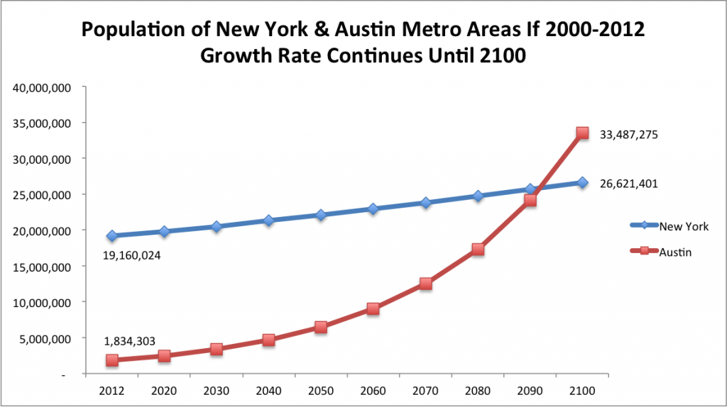
So, will the Austin metro area’s population actually surpass New York’s by the end of this century? Well, I guess you should never say never…but you can see how dangerous it can be to assume that recent trends will simply continue on into the distant future.
Taking this example farther, what would happen if we assumed that the region’s growth rate since 2000 (46.8%) continued not just until 2100, but until 2200? Under this assumption, the Austin region’s population would surpass 900 million by 2200. That’s nearly 3 times the current population of the entire United States! I don’t even need to emphasize how ludicrous this sounds. Maybe you’ll remember this next time you find yourself at a cocktail party and someone is talking about a recent trend as if it was a law of nature that will go on uninterrupted for centuries.
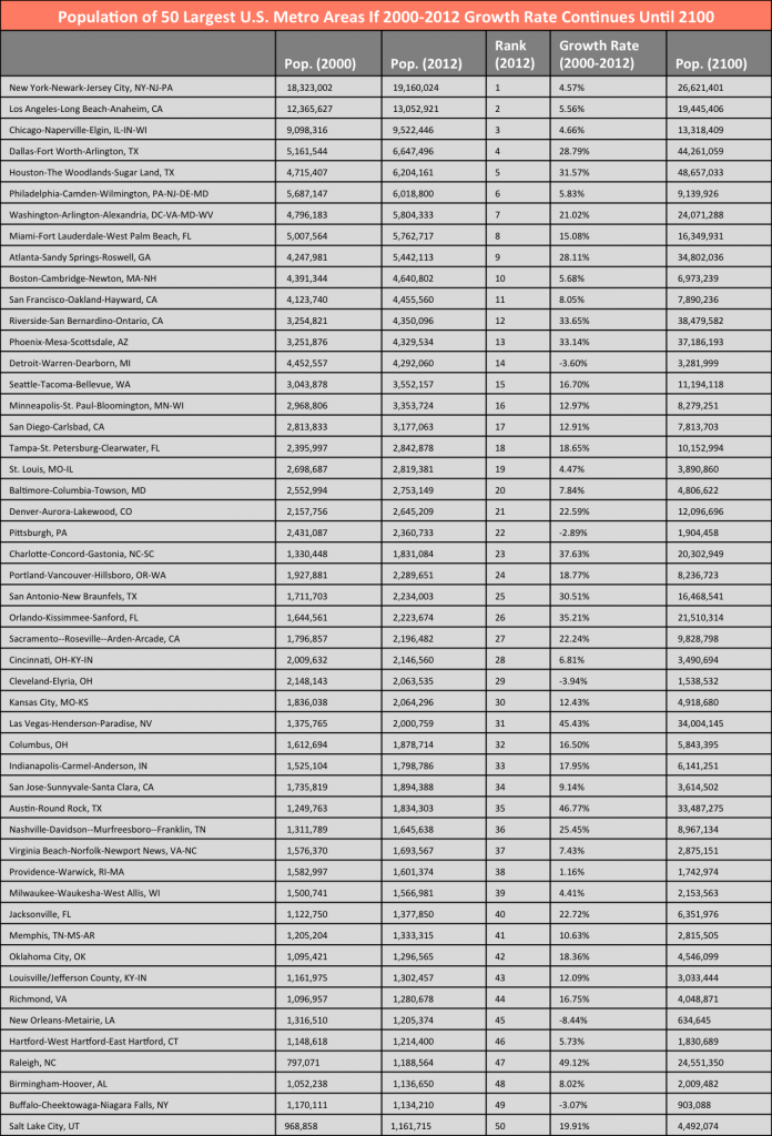
In case you’re interested, here’s a table with the results of this simple extrapolation of the 2000-2012 population growth rates to 2100 for each of the 50 largest metro areas in the U.S.:
Trend Analysis Example #2: The City of Detroit vs. itself
Detroit is well-known in American culture as The Motor City, Motown, and Detroit Rock City. These days, it is perhaps most well-known for its dramatic decline in population over the last several decades. Despite what many people believe, Detroit’s problems are not simply due to its location in the heart of the Rust Belt region of the Midwestern U.S. The primary cause of Detroit’s economic and population decline has been its lack of economic diversification and extreme dependence on a single industry: the automotive sector. I’ve written more about this here.
So, what would happen if Detroit’s 2000-2012 population growth rate of -26.7% (rate of decline to be more precise) continued until 2100? Detroit in 2100 would have a population of 80,245. Here’s a graph that shows what this would look like:
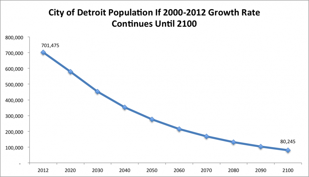
Just for kicks, what if we assumed this same rate of decline all the way out to 2200? Detroit’s population would dwindle down to 6,790. This is less than 25% of Fall 2013 total enrollment at Wayne State University, Detroit’s largest academic institution.
How realistic are these scenarios? I’ll leave that up to the futurists, but I would like to leave you with a brief commentary on the prospects for large Rust Belt cities.
Imminent population rebound for large Rust Belt cities?
Many Rust Belt cities have actually done quite well for themselves, growing at a steady pace during the last several decades. These steady-growth Rust Belt cities –Columbus, Indianapolis, Madison, Grand Rapids, Fort Wayne – often get left out of the conversation by people who paint the entire Midwestern U.S. as a vast region of decay. And just to be clear, I’m talking about the central city only in this case, not the entire metro area. If we did consider metro areas, we could add several other regions to the list of “steady-growth” examples: Minneapolis-St. Paul, Chicago, Milwaukee, etc.
But for each story of a successful Midwestern city, there is also a story of another Rust Belt city that has experienced a prolonged downturn. In fact, there were several major Rust Belt cities – the central city, not the metro area – whose populations peaked in 1950 and then experienced massive population declines in each of the next six decades until 2010. Detroit is one of these.
However, it appears that the massive losses of residents have pretty much stopped in many of these cities. Let’s take a look at 5 other Rust Belt cities that had similar population declines to Detroit, starting in 1950 and continuing until 2010: Pittsburgh, Cincinnati, St. Louis, Buffalo, and Rochester. Here’s a graph showing the decades-long decline and recent stabilization of these cities:
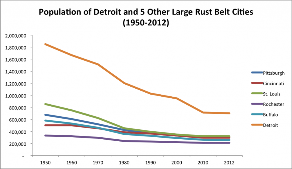
Each of these cities reached its peak population in 1950 and subsequently lost residents for 6 straight decades. Yet, from 2010 to 2012, 2 of these cities – Pittsburgh and Rochester – actually gained residents for the first time in 60 years. And the other 3 – St. Louis, Cincinnati, and Buffalo – while they still lost residents from 2010 to 2012, they experienced the biggest slowdown in population decline in 60 years, a decline of less than 1% in each case.
It looks like the tide has turned for these cities. Perhaps Detroit’s decline is almost over as well. Here are a couple more signs that Detroit’s rebound may be just around the corner.
- This article from the Harvard Political Review describes how Detroit’s situation is stabilizing thanks to much-needed diversification of its economy.
- In this Atlantic Cities article, Richard Florida makes the case that “the ingredients for long-run economic recovery are already present” in the Detroit region.
- And this article from NBC News highlights Detroit as one of the nation’s “Top 10 turnaround housing markets”.
Trend Analysis Example #3: U.S. oil & gas industry vs. U.S. economy as a whole
Surely you’ve heard stories about the booming oil & gas industry similar to this one. Perhaps you’ve heard of the West Texas oil boom taking place in Midland and Odessa, the two metro areas with the highest job growth rate in the past year. Or maybe you’ve heard of the North Dakota oil boom centered on the Bakken Shale formation that has turned once-sleepy towns like Williston, ND into modern-day Wild West boomtowns. Or maybe you’ve heard of these regions: the Eagle-Ford Shale region in South Texas, the Barnett Shale formation in North Texas, or the Marcellus Shale region in Pennsylvania.
Okay, you get the picture. The national consensus these days appears to forecast a future of endless domestic oil and gas industry growth. Funny, seems kind of quaint to think back a few years to 2007-2008 when it seemed like “Peak Oil” was imminent. Each of these stories about a new oil boomtown adds fuel to the fire (pun intended) about the national belief that the energy industry will continue to expand rapidly for decades to come.
In all fairness, the U.S. oil/gas sector has grown at a very high rate in recent years. According to the U.S. Energy Information Administration, from the start of 2007 through the end of 2012, oil & gas industry employment grew by 40% compared to a 1% job growth rate for the private sector as a whole.
But many of these stories would have you believe that the oil and gas industry is the most important industry in the U.S. economy, and that growth in oil & gas equals growth in the economy as a whole. The truth is that, as of 2012, the U.S. oil & gas industry only accounts for 0.5% of all private sector jobs (569,000 jobs out of more than 111,218,400 total private sector jobs).
So, what would happen by the year 2100 if the oil & gas industry continued to grow by 40% every 6 years, while U.S. employment in the economy at large continued to grow by 1% every 6 years growth rate continued until 2100? The oil and gas industry would account for about 40% of all U.S. jobs. Here’s a graph that shows this scenario:
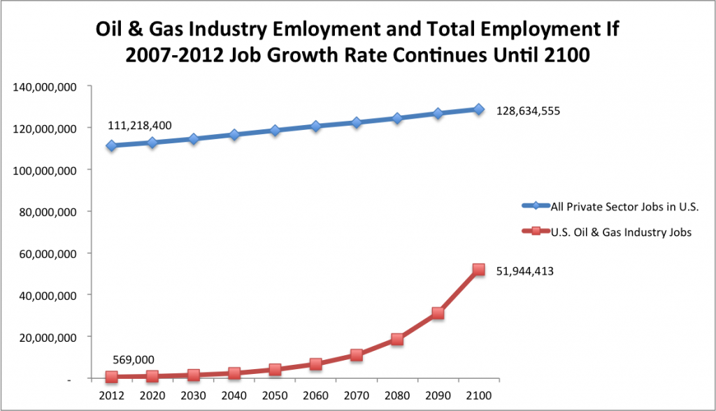
Of course, who’s to say which side – the Peak Oil crowd or the oil/gas boosters – will have predicted the future more accurately by 2100? As with any forecast, no one knows for sure, but the reality often ends up being somewhere between the two extremes.
How to use trend analysis properly
There are 3 important factors to consider when using trend analysis. Next time you’re dealing with trend data, ask yourself the following questions:
- What is the starting point and ending point of the historical data?
- Are there any natural limits that impact this trend?
- What are the major factors that influenced recent trends? And how are these factors different now, or how do these factors seem to be changing?
Trend Analysis Consideration #1: Starting point and ending point of historical data
Using our Austin vs. New York example again, what would have happened if we use different years for the growth rate? Instead of using the 2000-2012 growth rates, what if we just use the past 2 years (2010-2012) instead? The Austin metro area population grew by 6.2% from 2010 to 2012, while New York’s metro area grew by 1.2%. If these growth rates continued every 2 years until 2100, Austin’s metro area population would reach 19,671,725, and New York’s metro area would grow to 32,998,950. A very different result than the example we used in the graph above that puts Austin on a trajectory to surpass New York’s population by 2100.
Trend Analysis Consideration #2: Natural limits
Natural limits of trend data analysis include absolute limits like fossil fuels that are not renewable or a limited amount of land to be developed within a metro area. They also include natural pricing mechanisms that exist in the marketplace. What would be a good example of a natural pricing mechanism that limits growth? The price of land. Real estate prices rise in cities that are desirable and rapidly growing, especially in the most desirable areas of the city. This puts downward pressure on growth simply because some people cannot afford to live in the city.
On the other hand, when a city declines for many years, it becomes much more affordable. This is actually one of the factors creating new growth opportunities in Detroit. Other Rust Belt cities that have lost population for many years are also beginning to capitalize on their real estate affordability. There are examples of urban revivals in nearly all of the major Rust Belt cities. Here are just a few examples: Milwaukee, Grand Rapids, and Cleveland. This revitalization is being driven by young professionals and entrepreneurs who are attracted by the affordability in these cities compared to the high cost of living in larger cities like New York, Boston, and D.C.
Trend Analysis Consideration #3: Major factors influencing trends
Let’s go back to the Detroit example for a minute. What were the factors that caused the city’s multi-decade decline? In 1950, Detroit was a very large city, with nearly 2 million residents, making it the 4th biggest city in the U.S. The city had experienced astronomical growth for decades, primarily fueled by its automotive sector. Detroit served as the literal and figurative headquarters of the entire U.S. manufacturing industry. In 1950, the U.S. served as the world’s factory and Detroit sat at the top of this hierarchy.
Now, fast-forward to 2014. The U.S. is no longer the world’s factory. China now occupies that role. Detroit is no longer the 4th largest city in the U.S. With a population of 701,475 as of 2012, it is barely even in the top 20 (18th largest in U.S.). And after decades of job losses in the U.S. manufacturing industry, the U.S. has actually gained manufacturing jobs in recent years. And the long downturn experienced by Detroit has led to low real estate prices, creating new possibilities for economic growth as mentioned above.
All of this puts Detroit in a very different situation than it faced in 1950. Perhaps it is a bit counter-intuitive at first, but if you look closely at the major factors that influenced Detroit’s dramatic decline, you’ll see that most of these factors have either reversed or stabilized.
Bottom Line
So before you buy into the notion that it’s a good idea make a prediction by simply taking recent trend data and extrapolating it out into the future, remember the year 2100. And remember the 3 other numbers that go along with 2100:
- 33 million: the population of the Austin metro area
- 80,000: the population of the City of Detroit
- 40%: the percentage of all jobs that will be in the oil & gas industry.
And one last thing…next time you decide to use trend analysis, ask yourself, “Am I acting more like a futurist, or a fortune teller?”


Your graph showing population decline is very misleading, because the last jump, of two years, is the same width as the previous jumps showing ten year jumps. This makes it look like Detroit’s population has already stabilized, while the data doesn’t really support that. To fix it, you should either end your analysis at 2010 or shrink the width between the last two data points.
Hi Doug-
You’re right…thank you for pointing out how the chart showing Detroit’s population decline over the last several decades vs. 5 other Rust Belt cities is potentially misleading. While you’re right that it is not comparing apples to apples for the last segment (the others are for 10 year increments but the last is for a 2-year increment), Detroit’s population loss really is slowing down.
So the chart is not entirely misleading. In fact, the annual rate of population decline in the City of Detroit was 23,749 from 2000 to 2010. From 2010 to 2012 (the last segment in the chart) the annual rate of population loss was only 6,151. That’s more than 4x slower than the previous decade. And if you take the entire 1950 to 2010 timeframe, Detroit had an average annual rate of population decline of 22,716. Since this blog was written 1.5 years ago, some more up-to-date figures have come out of the Census. Detroit’s 2014 population is estimated at 680, 250. So, the city’s population is still declining…an annual average of 8,382 from 2010 to 2014…but a whole lot slower of a decline than the prior decade. Or the prior 60 years for that matter.
So there is hope for Detroit. It’s funny, I’m actually in Detroit right now for an Inner City Economic Summit, hosted by ICIC (Michael Porter’s research group/think tank) and it’s obvious that while serious challenges remain, that there are some major signs of life in the city. Thanks again for your comment.